Design Systems
Create your own custom design system to help build faster and visualise your design live.
How does it work?
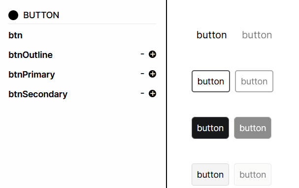
1. Left Pane
You have your component classnames on the left.
The fist entry is the base class, this is where you include styles you want all the variants to inherit.
For example, any styles placed in btn will be added to btnPrimary, btnOutline and btnSecondary. This is great place to put constant styles, such as your focus, disabled, and container styles.
2. Customizing
Clicking each class will open up individual utility classes used within it. You can choose to type in classes or use the selectors. Selectors are a great if you do not know the syntax of Tailwind too well. However, they do not provide every Tailwind class, nor allow arbitrary classes.
It should be noted, a text box category name is completely irrelevant, since all text boxes are merged during creation of the final copyable CSS. So it does not matter for example if you place a border class inside a text box labelled color! You can put everything in a single text box if you really want!
3. Adding and Removing
You can add or remove variants with the + and - icons. You must have at minimum 1 variant with the base (you can just delete it after copying if you are not using it).
4. Prefixing
The top navbar has a toggle to turn off prefixing. This removes all prefixes from the final CSS. Be careful as classnames can get confusing if you have not named them well!
We recognize that you may have a classname notation you are already following, therefore we provide this option to allow naming of classes to your rules. Hyphens and underscores are allowed. Numbers are too, if you place one at the start however it will be prefixed with an 'n' since CSS rules do not permit classes to begin with a number.
Global Styles
Expanding the right pane displays the global styles. Here you can choose to set any styles you may want to reuse. For example, a background color or a certain border radius. Similar to the left pane, you can type these global styles. To apply them, use the globe icon dropdowns under each of the categories in the left pane to apply that global style.
Global styles are a great way to ensure consistency when making your design system. You global styles will be saved with that particular design system only.
Usage
1. Copying
Once you are happy with your design system, hit the copy CSS button on the top nav.
This will format your design into Tailwind @apply rules with every base class and all your custom class names. Inherited classes are automatically added into the @apply statement.
2. Using a Class
Adding our classes to your elements is very straightforward. For example, to apply a button variant: className = 'btnPrimary'.
Adding simply className = 'btn' will give you your unstyled btn. This opens up possibilities to style on the go, like you would with regular inline Tailwind. Furthermore, you do not have to worry about overrides and such complications, as only your barebone styling would exist in this class.
For example, you may have a single instance of a button which still requires the base classes present in all your other buttons (like focus or disabled stylings) but don't what to create a whole class name for it:
className = 'btn bg-[#feedf2] border-2 border-emerald-800'
Helpful Features
1. Hover over a component to view how you would write it out in JSX.
2. Designs are auto saved every 2 minutes.
3. View all your designs by clicking My Designs on the left of the top navbar.